Eurobank - UX/UI Audit

Streamlning the way to better website sales, performance and usability.

IKEA store interior

How do we accurately evaluate a banks online presence?

How do we accurately evaluate a banks online presence?

Client: Eurobank

Duration: 6 months

Role: Research planning, Workshop Facilitation, Usability Testing, C-Level reporting

Challenge

The bank knew their web channels and services were not performing optimally but didn't know why. The needed a new UX strategy.

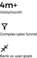
  1. 🏪 They had complex physical & digital sales funnels

  2. 🔍 Products were hard to find by users and drop-off rates were high

  3. 🛒 Sales and onboarding flows had dead ends, interruptions & distractions

Understanding Context
Eurobank case study screenshot
online banking

Approach

  • Gather learnings from users and all levels of bank stakeholders

  • Deploy mixed UX research methods for measurable results

  • Distill and tailor design guidelines for each department

Diagram of the tech exploration plan

Solution & Impact

A tailored UX strategy that identified Eurobank’s pain points and proposed engagement opportunities

  • Restructured content hierarchy, progressive disclosure and CTAs to improve task completion rate

  • Surfaced primary actions enhancing CTA click-through rate

  • Simplified navigation depth with that reduce cognitive load and user time on task

  • Shortened user decision-making through interactive tools like loan & investment calculators

  • Harmonized user flows with unified page layouts and predictable interactions to reduce drop off rates

A clear direction for the websites' redesign aligned with their value proposition

  • Aligned user journeys & business strategies, connecting silos

  • Mapped user flows, pinpointing redundancies and optimizing critical ones

  • Documented actionable steps for executives, designers and developers

Mapped actions to website areas & business outcomes.
Compilation of UIs
Benchmarking competitors & adherence to best practices
Compilation of UIs
Reports for technical teams & executives.

Process

  1. Analytics & hotjar

  • Over 315 sessions analyzed

  • Discovered dead-ends & u-turns

  • High drop off rates in purchase flows

  • Low traffic on core product pages

Individual physical product showcase

What did the bank have to say?

  1. Discovery workshop

Alligned the business objectives of 25+ stakeholders with the most important user journeys, breaking down department silos

a user testing the UI

Great! Now we can shortlist the areas to test

  1. Heuristic Evaluation

Evaluated best practices based on the objectives of:

  • Upselling

  • Conversion

  • Information

Exprience Dashboard

Do users face issues here?

  1. Extensive User testing

  1. User testing

20+

Moderated & Remote User Testings

Moderated & Remote Sessions

6

Main tasks

3

Competitors involved

Mock IKEA space for user testing

They did! Now we can propose fact-based actions

  1. Reporting UX issues & actions

Documented actionable steps for executives, designers and developers. Mapped per site area and business unit.

Job Done!

Actionable steps for executives, designers and developers.
Job Done!

Mock IKEA space for user testing

Now lets be specific about the business value of each action.

Learnings

  • 👂 The more you say and write, the less is read & understood.

  • ⚔️ Priority of design optimizations normally follows expected business value but conflicting goals and politics can sideline that

  • 👀 Users often distrust large institutions.

  • 📱 Consistency in design systems, and existing mental models & accessibility rules = non-negotiable usability baseline

Create a free website with Framer, the website builder loved by startups, designers and agencies.